Prev
Next
Logo of HKMA 25th Anniversary
Graphic
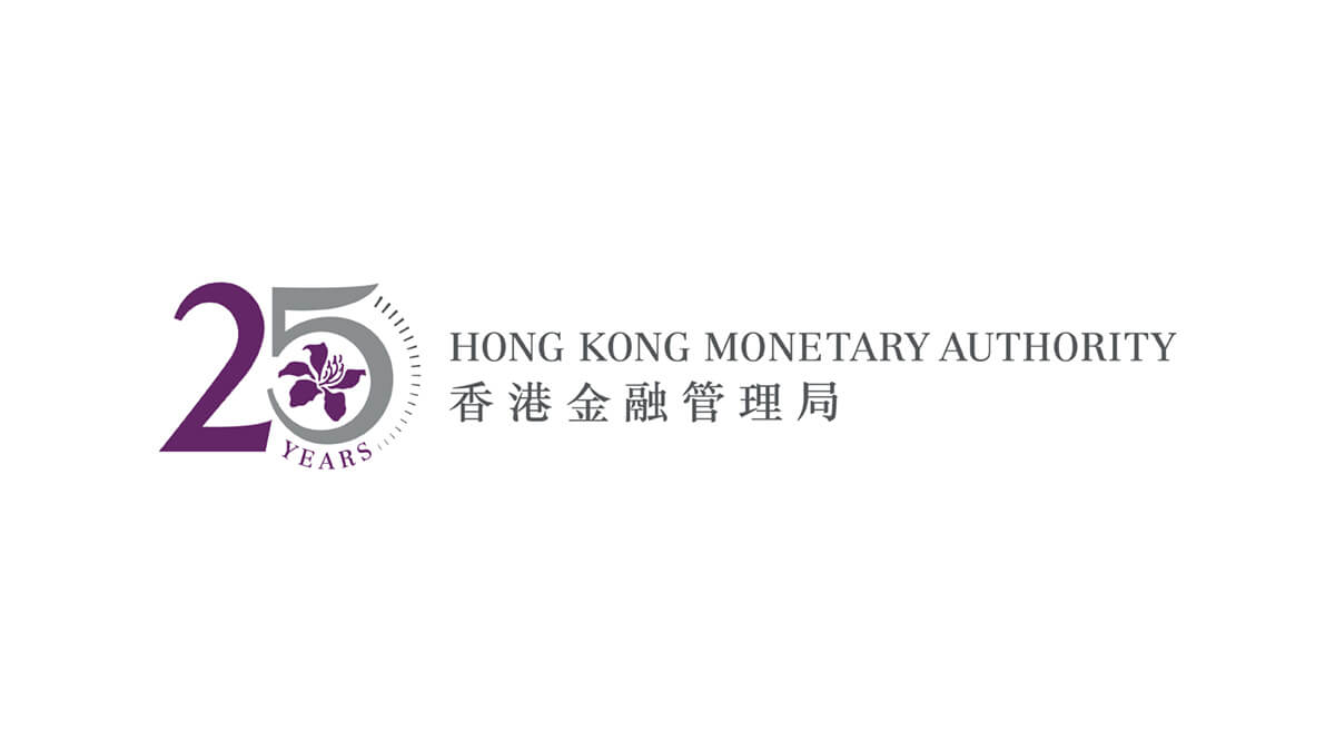
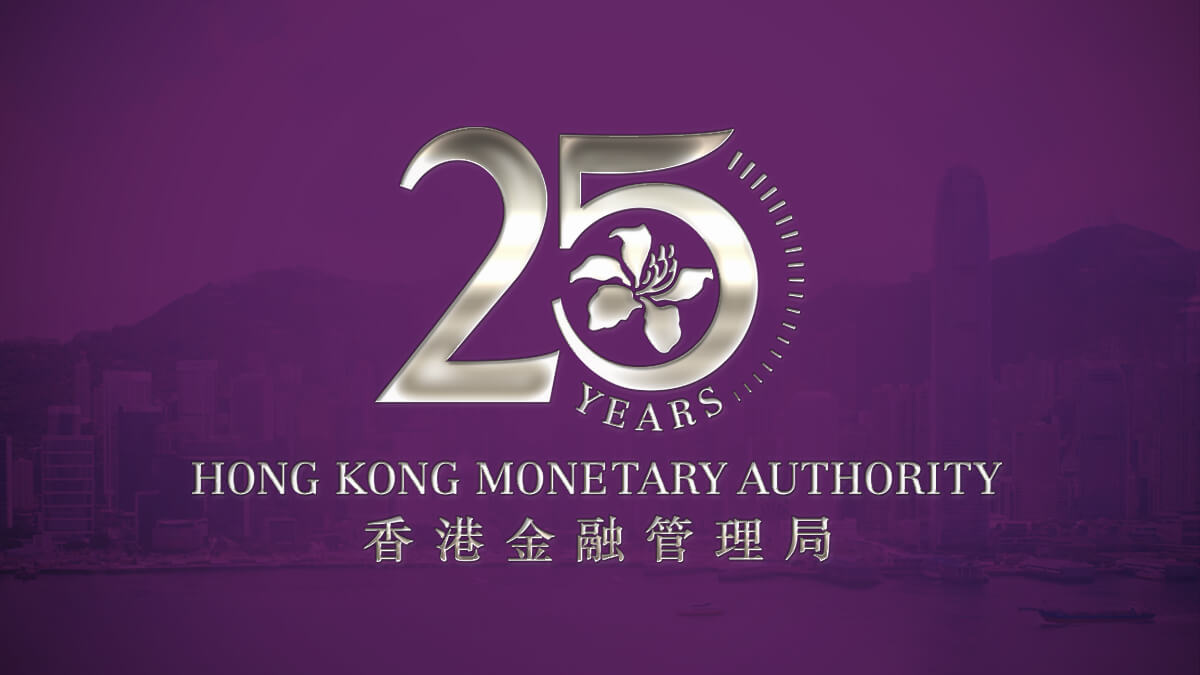
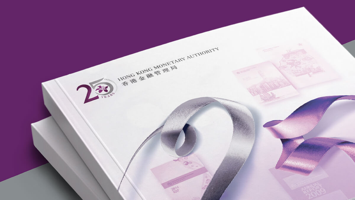
The design was inspired by Hong Kong currency – the font of “25” in the logo was modelled on that of the coins of $2 and $5 in circulation in Hong Kong, integration with the bauhinia in the logo of HKMA. It was further decorated with a semi-circular dotted line that resembled the rugged edge of a coin, symbolising money in circulation. In addition to the purple and dark grey colours in the original logo of HKMA, silver was also used to mark the silver anniversary of the organisation.
Location: Hong Kong
Client: HKMA
-
Logo of HKMA 25th Anniversary
-
![]()
-
![]()
-
![]()
-
![]()
-
![]()
The design was inspired by Hong Kong currency – the font of “25” in the logo was modelled on that of the coins of $2 and $5 in circulation in Hong Kong, integration with the bauhinia in the logo of HKMA. It was further decorated with a semi-circular dotted line that resembled the rugged edge of a coin, symbolising money in circulation. In addition to the purple and dark grey colours in the original logo of HKMA, silver was also used to mark the silver anniversary of the organisation.


